TLDR
Wedding invitation fonts should feel personal, but the details still need to be easy to read.
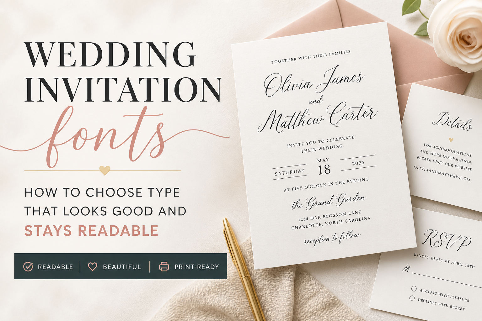
A good invitation usually uses one expressive font for names or accents and one readable font for the date, time, venue, RSVP line, and details. Script and calligraphy fonts can look beautiful, but they work best in small doses. The best test is simple: can a guest read the card quickly without guessing?
Introduction
A beautiful font can carry the whole mood of a wedding invitation. It can make the card feel formal, modern, romantic, relaxed, editorial, or classic before anyone reads a single line.
But wedding invitation fonts have a job beyond looking nice. Guests need to read names, dates, times, venue names, addresses, RSVP deadlines, and sometimes meal choices or travel notes. If the font makes those details hard to read, the design is working against the invitation.
That is the practical balance. Your type should feel like your wedding, but it should also print clearly, hold up on the paper you choose, and make the important information easy to find.
A dramatic script might be perfect for your names. That same script may be a bad choice for a street address, RSVP deadline, or hotel block note. This is one of those design decisions where restraint usually looks better in the end.
The First Rule: Guests Need To Read The Details
The first rule of invitation typography is simple: the guest should know what is happening, when it is happening, and where to go.
That sounds obvious, but it is easy to lose sight of it when you are comparing pretty scripts and calligraphy fonts. A wedding invitation is not only a keepsake. It is also an instruction card for a real event.
On the main invitation, the most readable information should usually be:
- the couple’s names
- the wedding date
- the ceremony time
- the venue name
- the city and state
- reception or RSVP direction, if included
That does not mean every line needs to be the same size. In fact, good hierarchy helps. The couple’s names can be larger. The date can have its own visual weight. The venue can be clear without shouting.
But the invitation should not make guests hunt for the basics.
A good test is to step back from the proof or zoom out on your screen. Can you still pick out the date and time quickly? Can someone older in your family read it without squinting? Can the venue name be understood at a glance?
If the answer is no, the font may be pretty, but the layout needs work.
For the main card, start with the wording itself. PrintInvitations’ Wedding Invitation Wording guide is a helpful companion because the font choice should support the structure of the wording, not cover up a crowded layout.
Script, Serif, Sans Serif, And Display Fonts
Most wedding invitation fonts fall into a few broad groups. You do not need to become a type designer. You just need to know what each style is good at.
| Font Style | What It Feels Like | Best Use | Watch Out For |
|---|---|---|---|
| Script fonts | Romantic, personal, handwritten | Names, short phrases, accent words | Hard-to-read letters, thin strokes, too many swashes |
| Calligraphy fonts | Formal, elegant, traditional | Couple names, formal headers | Flourishes that interfere with readability |
| Serif fonts | Classic, refined, editorial | Main details, formal wording, body text | Very thin serifs can soften on textured paper |
| Sans serif fonts | Clean, modern, simple | Details, RSVP cards, minimalist invitations | Too plain if not paired thoughtfully |
| Display fonts | Bold, decorative, distinctive | Large headlines or short design moments | Not suited for long wording or small details |
Script and calligraphy fonts are usually the ones couples fall in love with first. That makes sense. They feel personal. They add movement. They can make a simple 5×7 card feel designed.
But scripts also create the most readability problems. Some letters can be hard to distinguish. Capital letters may be ornate. Long names can become tangled. Flourishes can run into nearby lines. At small sizes, thin strokes may fade or print less clearly than expected.
Serif fonts are usually safer for formal or traditional invitations. They work well for full names, spelled-out dates, and classic wording. A serif can feel elegant without needing much decoration.
Sans serif fonts are often best for modern wedding invitations, RSVP cards, and details cards. They are clean and practical, especially when guests need to read small information quickly.
Display fonts should be used carefully. They can add personality, but they usually work best in one short place, not across the whole card.
How Many Fonts Should A Wedding Invitation Use?
Most wedding invitations should use two fonts.
One font can be expressive. The other should be readable. That pairing gives you personality and clarity without making the card feel busy.
A common setup looks like this:
| Role | Recommended Font Type | Example Use |
|---|---|---|
| Main personality font | Script, calligraphy, serif display | Couple’s names |
| Supporting readable font | Serif or sans serif | Date, time, venue, RSVP line |
| Optional accent style | Italic, small caps, or different weight from the same family | “Reception to follow” or small divider text |
You usually do not need three completely different font families. If the design needs another layer, use a different weight, italic, or capitalization style from one of the existing fonts.
For example, a formal invitation might use a script for the couple’s names and a serif for everything else. A modern invitation might use a clean sans serif for most text and a high-contrast serif for the names. A romantic garden invitation might use a soft script with a readable serif underneath.
The danger zone is using a script, a serif, a sans serif, and a decorative display font all on the same card. That can make the invitation feel less polished, not more.
A strong font pairing should feel intentional. The guest should notice the invitation, not the font menu.
Font Size, Spacing, And Contrast In Print
A font can look readable on screen and still feel too small in print. This is especially true on phones, where you may be viewing a proof larger than the final card.
Before approving your invitation, view the proof at actual size or print a quick sample at home. It will not match the final paper or print quality, but it can help you catch text that is too small, too cramped, or too faint.
Pay attention to these details:
Font Size
Names can be large. Details need to be large enough to read comfortably. Tiny text can look elegant in a mockup, but it can become frustrating on the actual card.
Line Spacing
Script fonts often need more breathing room than serif or sans serif fonts. If lines sit too close together, flourishes can collide with nearby text.
Letter Spacing
All-caps text often needs a little extra spacing. Too much spacing can also make words harder to read, so use it lightly.
Contrast
Light gray, pale blush, champagne, sage, and beige can look beautiful. But if the contrast is too low, guests may struggle to read the card. This matters even more for RSVP cards and details cards.
Paper Texture
Textured paper can soften fine lines. That can be beautiful for formal stationery, but very thin type may not stay as crisp as it looks on a screen. Smoother paper often supports sharper detail, while textured stock adds a more tactile feel.
This is where paper and typography work together. A thin modern serif on smooth stock may print cleanly. That same delicate font on a heavily textured stock may lose some sharpness. If paper feel matters to you, compare the type against the stock and finish, not just the design preview. PrintInvitations’ Paper & Print Options page is useful here because paper texture, finish, and print clarity all affect the final result.
Font Pairing Examples By Wedding Style
Font pairing is easier when you start with the tone of the wedding. Do not choose fonts in isolation. Choose them for the event you are actually inviting people to attend.
Formal Or Black Tie Wedding
Use a refined script or calligraphy font for the couple’s names, then pair it with a classic serif for the rest of the wording.
This works well with Formal Wedding Invitation Wording because traditional wording often has more lines. The supporting font needs to be readable and calm.
Good setup:
- Script for names
- Serif for date, time, venue, and reception line
- Generous spacing
- Dark ink on light paper
- Optional foil used sparingly
Avoid using ornate script for every line. It may look formal at first, but it becomes hard to read quickly.
Modern City Wedding
Use a clean sans serif with a stylish serif or a stronger typographic contrast.
This can look polished without feeling traditional. Modern layouts often work well with shorter wording, numerals, and clear spacing. If you are using Modern Wedding Invitation Wording, the font system should feel clean and current too.
Good setup:
- Serif or clean display font for names
- Sans serif for details
- Strong spacing
- Minimal decoration
- High contrast ink color
Avoid thin, low-contrast type in pale colors. Minimal design still needs enough strength to print clearly.
Romantic Garden Wedding
Use a soft script or handwritten-style font for names, then pair it with a readable serif.
This style can handle gentle curves, floral artwork, and softer paper choices. The trick is keeping the details grounded. If the artwork is already decorative, the detail font should be simpler.
Good setup:
- Flowing script for names
- Warm serif for supporting text
- Plenty of line spacing
- Soft but readable color
- Light floral accents
Avoid stacking too many delicate elements. A delicate script plus pale ink plus textured paper plus detailed florals can become hard to read.
Casual Or Outdoor Wedding
Use a relaxed handwritten font or friendly serif for names, then pair it with a clean sans serif.
This keeps the invitation warm without making it feel messy. Casual does not mean unclear. Guests still need the same details.
Good setup:
- Casual script or simple serif for names
- Sans serif for practical details
- Natural spacing
- Clear RSVP direction
- Simple color palette
Avoid fonts that look too childish or novelty-driven unless that is truly the style of the event.
Minimalist Wedding
Use one font family with multiple weights, or pair a modern serif with a neutral sans serif.
Minimalist invitations rely on spacing, alignment, and paper quality. The type needs to be quiet but not weak.
Good setup:
- One clean font family
- Different weights for hierarchy
- Strong margins
- Clear date and venue treatment
- No unnecessary flourishes
Avoid making everything tiny. Minimalist does not mean unreadable.
Fonts To Avoid On RSVP Cards And Details Cards
RSVP cards and details cards need to work harder than people expect. They are smaller, more practical, and often carry information guests need to act on.
Your RSVP Cards should make the response process obvious. Your Details Cards should make travel notes, website information, reception details, or dress code guidance easy to scan.
That means these cards are usually not the place for your most decorative font.
Avoid using hard-to-read fonts for:
- RSVP deadlines
- meal choices
- website URLs
- venue addresses
- hotel block names
- shuttle times
- dress code notes
- QR code instructions
- return mailing instructions
A script heading that says “RSVP” can work. A full RSVP card in script usually does not.
The same goes for details cards. A small script label like “Details” or “Weekend Notes” can be lovely. But the actual information should be set in a readable serif or sans serif.
This is especially important for website URLs. If a guest cannot tell the difference between a lowercase “l,” uppercase “I,” number “1,” or a fancy swash letter, you will get unnecessary questions.
Not exactly the romantic stationery moment anyone was hoping for.
How Fonts Behave Differently On Paper
Fonts are physical once they are printed. That changes things.
On a screen, a thin line can look clean because the display is lighting it from behind. On paper, ink sits on a surface. The paper color, texture, finish, and ink contrast all affect how that type reads.
A few print behavior rules help:
Thin fonts need enough contrast.
A delicate serif or thin script should usually be printed in a darker color, especially on textured paper.
Small type should be simple.
The smaller the wording, the less decorative the font should be.
Foil needs space.
Foil can look beautiful on names, monograms, borders, or short accents. It is usually not the best choice for dense wording or tiny details.
Texture softens detail.
Felt, eggshell, and other textured papers can add character, but very fine type may not look as crisp as it does on a smooth stock.
Proofing matters.
A proof gives you a chance to catch spacing, hierarchy, typos, and readability before print. Do not only check whether the names are spelled correctly. Check whether the whole card can be read easily.
On PrintInvitations, Wedding Invitations are meant to be reviewed as a full printed piece, not just a design file. Font choice, paper choice, and layout all work together.
A Quick Wedding Invitation Font Checklist
Use this before approving your proof:
- Use the focus font for names or short accents, not every line.
- Keep the date, time, venue, and RSVP information easy to read.
- Limit the suite to two main fonts when possible.
- Use spacing and size to create hierarchy.
- Avoid low-contrast ink for small details.
- Check script capitals carefully.
- Keep website URLs in a very readable font.
- Do not use decorative fonts for meal choices or addresses.
- View the proof at actual size.
- Make sure the fonts still work on RSVP cards and details cards.
- Match the font style to the wording tone.
- Consider how the paper texture may affect thin lines.
The best wedding invitation fonts look personal without making guests work. That is the goal.
Final Thoughts
Wedding invitation fonts should support the invitation, not compete with it.
Start with readability. Then add personality. Use script or calligraphy where it has the most impact, usually on names, headings, or a short accent line. Use a clear serif or sans serif for the information guests need to understand quickly.
A good font pairing makes the invitation feel designed. A bad one makes the invitation feel crowded, confusing, or harder to use than it should be.
Your invitation can be romantic, formal, modern, or simple. Just make sure the type lets guests read the details without guessing. That is what makes the design feel polished in real life.
FAQs
What Are The Best Wedding Invitation Fonts?
The best wedding invitation fonts are readable, balanced, and matched to the tone of the wedding. Scripts and calligraphy fonts work well for names. Serif and sans serif fonts usually work better for dates, times, addresses, and RSVP details.
Can I Use A Script Font For The Whole Invitation?
Usually, no. A script font can look beautiful for the couple’s names or a short phrase, but it often becomes hard to read across the full invitation. Pair it with a readable serif or sans serif font.
How Many Fonts Should A Wedding Invitation Have?
Most wedding invitations should use one or two font families. If you need more hierarchy, use different weights, italics, capitalization, or spacing from the same family instead of adding another unrelated font.
What Font Size Should Wedding Invitations Use?
There is no single correct size because fonts vary. Names can be larger, while supporting details can be smaller, but the date, time, venue, and RSVP information should still be easy to read at actual printed size.
Should RSVP Cards Use The Same Fonts As The Invitation?
Yes, but with restraint. RSVP cards should feel connected to the invitation suite, but they need practical readability. Use the decorative font sparingly and keep the response details clear.
Are Thin Fonts Bad For Wedding Invitations?
Thin fonts are not automatically bad, but they need good contrast and the right paper. Very thin type can become harder to read on textured paper, pale ink colors, or small details.