
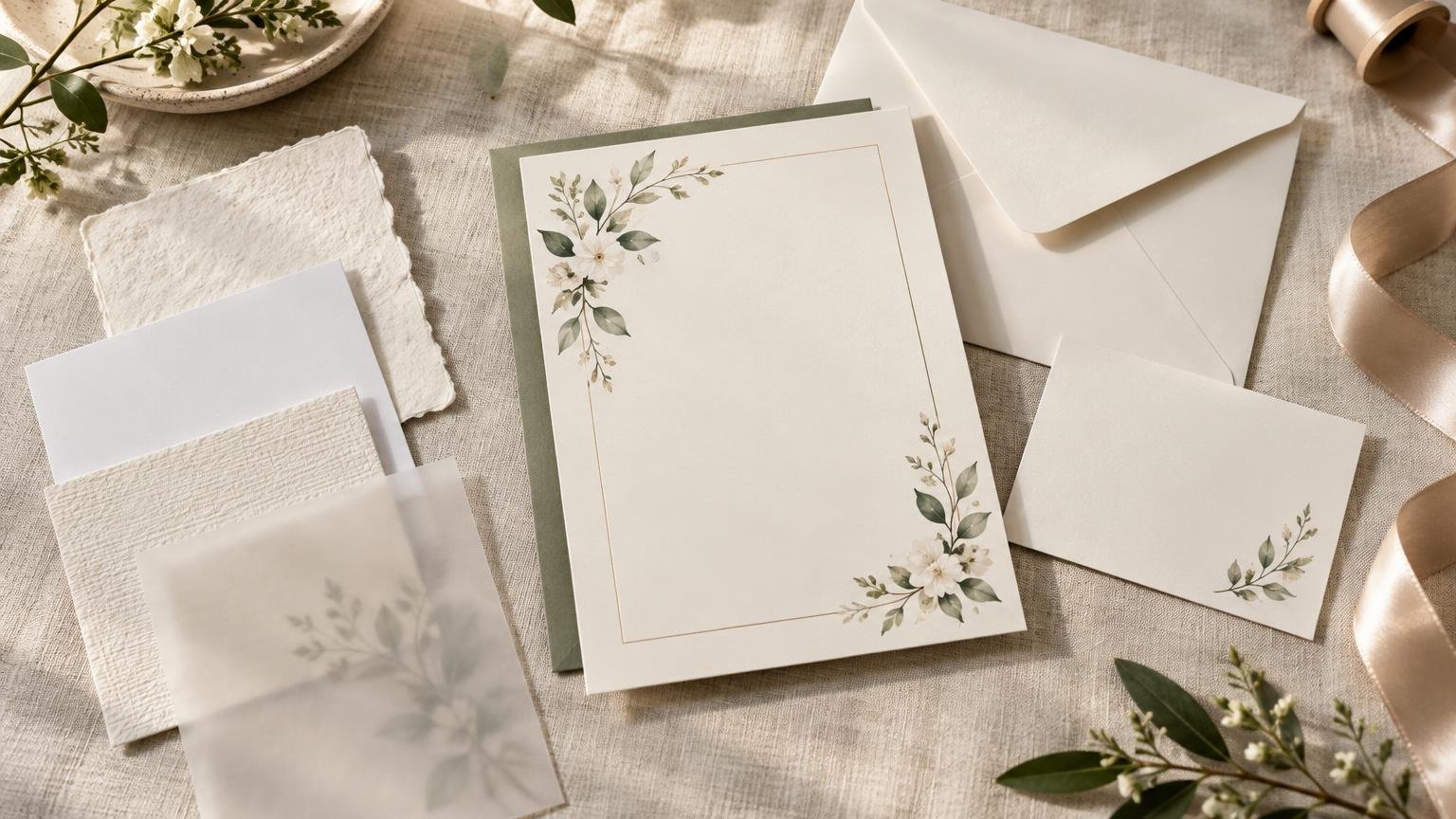
TLDR
For most wedding invitations, smooth or eggshell cardstock is the safest starting point. Smooth paper keeps small type and detailed artwork crisp, while eggshell adds restrained texture without dominating the design. Choose felt when you want a softer, more traditional character, and pearlescent paper when a gentle shimmer suits the artwork. Treat paper surface, weight, finish and printing method as separate decisions. Before ordering the full quantity, confirm that the chosen combination works with your design, envelope and mailing plan.
Start by separating paper from finish
“Paper type” often gets used as a catch-all, but several characteristics create the finished invitation. The stock determines the surface and base appearance. Weight and caliper affect substance and thickness. A coating changes reflectivity and handling, while a process such as foil, embossing or letterpress adds a decorative or tactile effect.
These distinctions matter because two invitations described as matte can feel completely different. One may be a smooth, substantial card with a low-glare coating; another may be an uncoated textured stock. Technical properties also vary by specific paper grade. The Mohawk digital paper specifications show that caliper, opacity, brightness and smoothness can differ even among papers within the same broad product family. Lower Sheffield values indicate a smoother surface, while caliper measures physical thickness.
Use weight as one factor rather than the entire decision. A higher listed weight does not automatically tell you how stiff, thick or suitable a sheet will feel. For a closer look at that distinction, see the guide to choosing wedding invitation paper weight.
How the main invitation paper types compare
| Paper type | Visual and tactile effect | Usually works well for | Watch for |
|---|---|---|---|
| Smooth | Clean surface with little visible texture | Fine typography, detailed illustrations, photographs and modern layouts | Minimal texture means the design and print quality carry most of the visual interest |
| Felt | Soft, lightly textured and traditional | Classic suites, restrained artwork and designs meant to feel tactile | Very fine details may reproduce differently than they do on a smooth stock |
| Eggshell | Subtle texture between smooth and strongly tactile paper | Versatile formal or semi-formal invitations | Texture can influence solid color areas and delicate lines |
| Pearlescent | Gentle shimmer that changes with the light | Evening celebrations, soft color palettes and selective decorative designs | Glare and shimmer can compete with small type or already-busy artwork |
| Heavy cardstock | More substance in the hand | Simple invitations where the physical card should feel substantial | Thickness can affect printing compatibility, suite bulk and mailing |
PrintInvitations currently presents smooth, felt, eggshell and pearlescent choices, as well as different thicknesses and specialty options. Availability can vary by product, so use the current paper and print options as the starting point and confirm the choices shown in the actual invitation configuration.
Match the stock to the design
Smooth stock is the practical choice when legibility and precise reproduction come first. It gives thin lines, small serif type, watercolor details and photographs a relatively even surface. It also suits minimalist invitations, where uneven lettering or a muddy fine line would be especially noticeable.
Eggshell is a useful middle ground when smooth paper feels too plain but a pronounced texture feels too traditional. Felt has more tactile presence and can support classic typography or understated artwork. Pearlescent paper is best treated as part of the color and lighting plan, not as an automatic premium upgrade. Its shimmer may enliven pale colors, but it can also reduce contrast under direct light.
If you are printing artwork purchased from a marketplace, inspect the file before choosing an expressive stock. Delicate lines, pale lettering and low-resolution graphics leave less room for variation. The guide to printing Etsy wedding invitation templates explains the file-preparation checks that should happen before paper selection becomes final.
Choose the finish separately
A natural or uncoated-looking presentation keeps shine low and lets the underlying paper character remain visible. UV matte provides a low-glare finished appearance, UV gloss creates a more reflective surface, and satin sits between those two. PrintInvitations lists these as distinct options and also offers UV coating, but its general pages do not establish that every finish is available with every stock or product. Confirm the exact combination before designing around it.
Gloss can strengthen contrast and color but may feel less suitable for a soft, traditional design. Matte is easier to view without strong reflections, although “matte” alone says little about the stock beneath it. Satin can be a practical compromise when you want some color richness without a highly reflective surface.
Foil, embossing and letterpress are processes, not paper types
Specialty printing affects which paper will work. Embossing creates a raised surface, while debossing presses an indentation into the paper. Letterpress combines ink with a pressed-in impression. Flat foil places a metallic treatment on the surface without the reverse-side impression associated with traditional die foil stamping. These terms describe different processes and should not be used interchangeably.
Foil is usually strongest as an accent on names, a monogram or a small border rather than a substitute for all printed information. Deep impressions and heavy embellishment also require enough stock thickness and a compatible production process. Ask whether the effect changes the reverse side, whether fine lines have minimum requirements and whether the selected paper is approved for that technique.
A digital proof cannot show paper feel
A proof is still essential for checking wording, dates, addresses, personalization and layout. PrintInvitations states that every order includes a free digital proof and that physical proofs and samples are available for a fee. A digital proof can catch a misspelled venue, but it cannot accurately demonstrate texture, stiffness, shimmer or the way a coating reflects light.
Paper choices can change mailing costs and handling
Evaluate the assembled suite, not only the main card. USPS letter-size mail must fall within specified dimensions, thickness and weight limits: 5 to 11½ inches long, 3½ to 6⅛ inches high, 0.007 to ¼ inch thick and no more than 3.5 ounces. A piece outside the applicable limits may be priced or classified differently. USPS Postal Explorer provides the current dimensional rules.
Square envelopes, excess rigidity, uneven thickness and certain decorative elements can make an invitation nonmachinable. USPS also advises placing envelopes with wax seals, ribbon or string inside another envelope for protection and taking decorated invitations to a Post Office counter when requesting hand-canceling. Review the current USPS invitation-mailing guidance, then have one complete, sealed suite weighed and evaluated before buying postage for the entire order.
A practical paper-selection checklist
- Choose the design first, noting fine type, photographs, pale colors and intricate line work.
- Decide whether you want a clean surface, subtle texture, stronger tactile character or shimmer.
- Compare actual samples rather than relying only on stock names or screen images.
- Confirm the specific stock, weight, caliper, coating and specialty process available for your product.
- Check readability under daylight and indoor lighting.
- Review and approve the proof for wording, dates, addresses, alignment and personalization.
- Assemble one complete suite in its envelope and measure its thickness and weight.
- Ask USPS to evaluate unusual shapes, rigid cards, wax seals or other decorative elements before mailing.
The best choice is the one that supports the invitation
Choose smooth stock for precision, eggshell for versatile understated texture, felt for a softer classic character and pearlescent paper for controlled shimmer. Then decide separately how substantial the card should feel and whether matte, satin, gloss, foil or another process improves the design. The final check is physical: sample the paper, proof the wording and test the fully assembled suite before committing to the full print run.
References
- # Digital Papers
- Paper & Print Options – PrintInvitations
- Wedding Invitations – PrintInvitations
- Printing and Quality – PrintInvitations
- Embossed Wedding Invitations: Letterpress & Flat Foil Guide – Paperlust
- Proofing & Personalization – PrintInvitations
- 100 Retail Mail Letters, Cards, Flats, and Parcels | Postal Explorer
- How to Send a Letter or Postcard | USPS