TLDR
- Dark background invitations can look polished, dramatic, and modern, but they are less forgiving than pale designs.
- The biggest surprises usually come from color shift, finish choice, and readability, not from the background color alone.
- Smooth stock, strong contrast, and a real proof matter more on dark designs than people expect.
- If the design includes lots of solid dark coverage, thin type, folds, or specialty finishes, test before approving production.
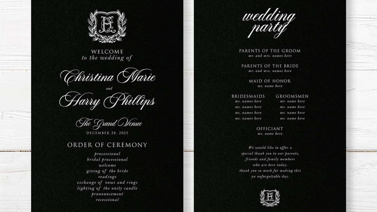
Dark background invitations can look incredibly good in print. They can also go wrong in very specific ways that a cream or white invitation tends to hide.
That is the main thing to understand before you print them. A dark design asks a little more from the file, the paper, the finish, and the proofing process. What looks rich and crisp on a bright screen can land a little flatter, softer, or shinier once it becomes ink on paper. That does not make dark background invitations a bad idea. It just means they reward careful choices.
If you love the look, the goal is not to talk you out of it. The goal is to help you make the style work on purpose.
Why dark background invitations behave differently in print
The first thing to know is simple: screens and printed pieces do not create color the same way.
A screen is luminous. Paper is reflective. Your monitor is giving you light. Your invitation is borrowing light from the room. That difference matters even more when the design depends on deep black, charcoal, navy, forest, burgundy, or another saturated dark tone.
Dark backgrounds are also more dependent on the exact combination of file setup, paper, and finish. The same artwork can feel softer on one stock, denser on another, brighter with a reflective finish, or more muted with a softer surface. This is why dark invitations often surprise people who only reviewed them on screen.
In plain terms: do not judge the final result by your laptop alone.
Contrast is the first design decision
With dark background invitations, contrast matters more than decoration.
A pale serif, a crisp sans serif, or a restrained metallic accent can look beautiful against a dark field. But tiny script, hairline strokes, and low-contrast details can become harder to read once they are printed, especially under warm indoor lighting.
This is one of those places where good taste and practical judgment should be friends.
A few rules usually help:
- Keep the most important information, names, date, time, and location, in high contrast.
- Give light text a little room. Slightly larger type and more line spacing usually help.
- Be careful with delicate scripts for essential details.
- Avoid placing critical wording over busy dark florals, watercolor textures, or heavy photo shadows.
If the invitation looks elegant but guests have to squint, the design is doing one job and failing the other.
Paper choice matters more on dark designs
Dark background invitations do not live on color alone. The paper surface changes the result.
If your layout depends on crisp small type, fine rules, or a clean modern look, a smoother stock is usually the safer choice. Smooth surfaces tend to keep detail looking sharper. If you want texture, that can absolutely work, but texture adds character and slightly changes how the dark field and reversed text feel in person.
That is why this choice should be made together, not one layer at a time. Background color, paper, and finish are a package deal.
On PrintInvitations, the current Paper & Print Options page is a useful guide here because it breaks down how smooth, felt, eggshell, pearlescent, natural, UV matte, UV gloss, satin, and foiling change both appearance and feel.
In practice, a few combinations tend to make sense:
- Smooth stock plus UV matte or satin for dark modern layouts with crisp text.
- Heavier stock plus subtle texture for formal or classic designs, as long as the type stays readable.
- Pearlescent or other specialty stocks when you want the dark background to catch light a little more softly.
What you do not want is a design that depends on precision, then a paper choice that fights that precision.
Finish can make or break the mood
A dark invitation on the wrong finish can feel a little off, even when the file itself is good.
That is not because one finish is universally better. It is because finishes change how dark colors behave. A reflective finish can give deep colors more energy and polish. A softer finish can make the whole piece feel quieter, more understated, and sometimes more formal.
This matters more on dark background invitations because the finish is easier to notice. On a pale invitation, a finish choice might feel subtle. On a near-black design, it can feel like a major personality shift.
If you are deciding between matte, satin, gloss, or a specialty accent, think about the event itself:
- Evening, formal, black tie, or moody-modern designs often benefit from a finish that feels refined, not loud.
- Bold contemporary styles can handle more reflectivity.
- Romantic floral dark designs usually do better with balance than with maximum shine.
PrintInvitations also notes on its Printing and Quality page that finish affects how colors appear in the light, how bold or subtle the design feels, and how smooth the piece feels in hand. That is exactly why this choice deserves more thought on dark layouts.
Proofing matters more than usual here
If you are ordering dark background invitations, proofing is not the optional extra step for nervous people. It is the smart step.
A digital proof helps you catch layout issues, wording problems, spacing, and obvious contrast mistakes. But for dark designs, a physical proof or sample can be especially valuable because it lets you judge the part the screen cannot fully show: the actual relationship between ink, stock, finish, and room light.
That is often the difference between “this looked great on my phone” and “this looks exactly how I hoped.”
On PrintInvitations, the live Proofing & Personalization page currently states that every order includes a free digital proof, with physical proofs and samples available for a nominal fee. If you are particular about deep color, texture, or sheen, this is one of the best places to spend a little extra attention.
A physical proof is especially worth considering if:
- the whole front is dark or nearly full bleed
- the design uses pale type on a dark field
- the invitation folds
- you are choosing between two finishes
- you care a lot about the invitation feeling rich rather than just looking dark
Dark designs are less forgiving of small mistakes
This is not a reason to avoid them. It is just part of the tradeoff.
On a light invitation, a slight softness in contrast, a small edge rub, or a minor layout imbalance may barely register. On a dark invitation, those details tend to announce themselves faster.
That means the design should be a little cleaner, not busier.
It usually helps to:
- simplify the hierarchy
- reduce unnecessary ornament
- keep margins generous
- avoid overcrowding the bottom half of the card
- let the dark background act as the statement instead of forcing extra drama on top of it
In other words, once you choose a dark invitation, you often do not need to keep proving how dramatic you are. The paper got the message already.
Common mistakes to avoid
A few problems show up again and again with dark background invitations.
The first is designing for the screen instead of for print. Very luminous blacks, blues, and jewel tones can look richer on screen than they will on paper.
The second is choosing a dark background and then being too timid with contrast. If the wording matters, let it be legible.
The third is stacking too many variables at once, like dark background, delicate script, textured stock, fold, foil, and tiny secondary text. Any one of those can be beautiful. All of them together can become a negotiation.
The fourth is skipping a real proof because the mockup looked convincing. Mockups are persuasive little liars.
And the fifth is forgetting that the envelope, inserts, and mailing plan still matter. If the invitation is dark, refined, and carefully finished, treat the rest of the suite with the same level of thought.
When dark background invitations are a great choice
Dark background invitations are often a strong fit when you want the suite to feel:
- formal
- evening-oriented
- modern
- minimal but striking
- moody and romantic
- design-forward without being loud
They can be especially effective for black tie weddings, winter celebrations, museum or city venues, candlelit receptions, or events where you want the paper to feel a little more cinematic.
They are less natural for every event, of course. A bright casual garden brunch may want something softer and lighter. But when the tone is right, dark invitations can feel thoughtful, confident, and very polished.
The key is not just choosing the look. It is choosing the look with print in mind.
FAQs
Do dark background invitations cost more?
Not automatically. The dark background itself is not always the expensive part. Cost usually goes up when you add specialty finishes, foiling, heavier stocks, extra proofs, or more complex production choices.
Are dark invitations harder to read?
They can be if the contrast is weak or the typography is too delicate. With strong contrast and sensible type choices, dark invitations can read beautifully.
Should I use textured paper for a dark invitation?
Sometimes, yes. But if the design relies on small pale text or very fine detail, a smoother stock is usually the safer choice.
Is a digital proof enough for dark background invitations?
A digital proof is important, but a physical proof is often more useful on dark designs because it shows how the color and finish actually behave on paper.
Do dark invitations feel more formal?
Often they do, but not always. Dark backgrounds can feel formal, modern, dramatic, or minimal depending on the typography, paper, and finish around them.