
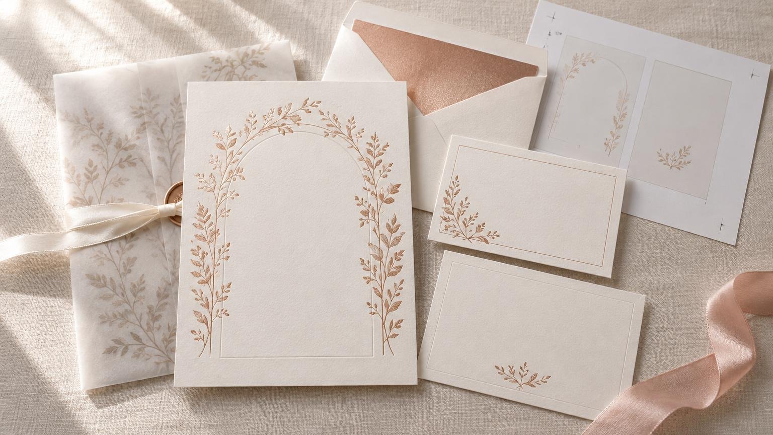
TLDR
Choose rose gold foil wedding invitations by confirming that the metallic detail is actual foil rather than a printed rose-gold color. Use foil selectively, choose paper that provides enough contrast, and verify which matching suite pieces are available. Before ordering, review a digital proof carefully, calculate quantity by mailing households, and allow time for production, shipping, assembly, and mailing. Take one fully assembled invitation to the post office before buying stamps because weight, shape, thickness, rigidity, and embellishments can change the postage required.
Rose gold foil wedding invitations can bridge romantic and modern styles, but the finish alone does not guarantee a polished result. The important decisions are where the foil appears, how it works with the paper and typography, and whether the complete suite remains easy to read, assemble, and mail. Start by verifying the production method on the exact product page; names such as “rose gold,” “metallic,” and “shimmer” do not necessarily describe the same process.
What makes a rose gold foil invitation different?
Foil stamping applies metallic foil to paper using heat and pressure, producing a reflective surface that responds to light. That differs from printing a flat rose-gold-colored graphic intended to suggest metal. Both approaches can be attractive, but only the first creates the characteristic reflective foil effect.
Do not assume that foil stamping also means embossing or letterpress. Depending on the printer, equipment, paper, and process, the finished area may feel relatively smooth, slightly raised, or subtly pressed into the stock. Ask the seller how the chosen product is produced if the tactile result matters to you. A physical sample is more useful than a screen image for judging reflectivity, texture, and the relationship between foil and paper.
The distinction also affects budget decisions. If you mainly want a warm copper-pink color, a printed metallic-style effect may satisfy the design brief. If you want details that flash as the card moves, real foil is the more relevant feature. The broader question of whether the upgrade earns its place is covered in this guide to whether foil details are worth it.
Choose where rose gold foil makes an impact
Foil usually works best as an accent rather than as the only thing holding the design together. Concentrating it on one or two important elements creates contrast while preserving readability. Useful placements include:
- The couple’s names or a monogram
- The wedding date
- A thin border or geometric frame
- Botanical linework or small floral details
- A short heading such as “Together with their families”
- A small divider, crest, star, or seasonal motif
Large areas of foil can dominate delicate typography, while very fine foil details may depend heavily on the printer’s production limits. Ask for the minimum line thickness and type size supported by the selected process before submitting custom artwork. If you are working from a template, avoid shrinking foil elements beyond the template’s intended scale.
Keep essential information readable without relying on shine. Venue names, times, URLs, and RSVP instructions should have enough contrast in ordinary indoor light. Foil can catch light beautifully, but its appearance changes with the viewing angle. Critical wording should not disappear when the card is held flat.
Match the foil to the design and paper
Rose gold is not one standardized color. One supplier’s version may lean pink, while another may look closer to copper or pale gold. Screen previews also cannot reliably reproduce the reflective surface. Treat any match to jewelry, table décor, bridesmaid dresses, or other materials as approximate unless you have compared physical samples under similar lighting.
| Paper or palette direction | Likely visual effect | What to verify |
|---|---|---|
| White or soft ivory | Clean, versatile contrast that keeps the foil prominent | Whether the paper has a warm or cool cast |
| Blush or pale pink | A tonal, romantic appearance | Whether the foil remains distinct from the background |
| Sage or natural neutrals | Soft botanical or outdoor-event styling | Text contrast and how muted colors reproduce |
| Navy, burgundy, or black | Dramatic contrast and a formal mood | Whether the design uses colored stock or printed color, plus envelope legibility |
| Textured stock | More tactile and organic | Whether the selected foil process reproduces cleanly on that texture |
Foil invitation collections may include minimalist, floral, monogram, geometric, formal, and seasonal designs, although availability depends on the individual retailer and product. Rose gold is often presented with blush, sage, and natural neutrals as an aesthetic direction rather than a fixed color rule.
Paper affects more than appearance. Thickness and stiffness influence handling, suite weight, and potentially mailing. A heavier stock is not automatically better if it makes the assembled suite bulky or exceeds the printer’s supported specifications. Use the wedding invitation paper-weight guide to compare the practical tradeoffs, then confirm the stock offered for the exact foil design.
Build the suite before choosing the invitation alone
Evaluate the whole mailed package rather than treating the main card as an isolated purchase. A typical suite may include the invitation, a details card, an RSVP card or online RSVP instruction, and one or more envelopes. Save the dates, thank-you cards, and other matching stationery can extend the design, but only if the seller offers coordinated pieces for that specific template.
Decide what information genuinely needs a separate insert. Travel information, reception details, attire guidance, and a wedding website can often share one well-organized details card. Additional cards increase printing cost, assembly time, envelope weight, and thickness. They should solve a communication problem rather than merely fill the envelope.
Card dimensions matter as well. The components should create a clear visual hierarchy and fit the intended envelope without crowding or movement. Review wedding invitation sizes, envelopes, and insert setups before combining pieces from different suppliers. If buying cards and envelopes separately, verify the finished dimensions rather than relying only on names such as A7 or RSVP envelope.
A coordinated suite does not require foil on every piece. One practical approach is to use foil on the invitation and print the secondary cards with matching typography and colors. This keeps the invitation as the focal point while controlling cost and reducing visual repetition.
Proofing, quantity, and timing checklist
A foil upgrade cannot rescue an incorrect date, misspelled name, or outdated RSVP address. Read the proof for content first and design second. Ideally, one person should compare it against the final event information while another reads every line independently.
- Finalize the date, ceremony time, venue name, address, RSVP method, deadline, and website before approving artwork.
- Confirm whether the preview shows actual foil placement distinctly from ordinary printed elements.
- Check names, titles, punctuation, capitalization, line breaks, and small text at realistic size.
- Verify card size, paper, foil color, envelope choice, quantity, and every included suite component.
- Ask what happens after approval, including the current production estimate, shipping method, rush availability, and correction or reprint policy.
- Save the approved proof and order confirmation for reference when the finished stationery arrives.
Calculate quantity by mailing households, not total guests. A couple or family at one address will often receive one invitation, subject to your guest-list and etiquette decisions. Then add extras for addressing mistakes, damaged pieces, late additions, keepsakes, photography, and any invitations that may need to be mailed again. Ordering a modest buffer with the original run is generally more practical than discovering later that a small reorder is unavailable or priced differently.
Build the schedule backward from the mailing date. Include design and revision time, proof approval, production, shipping, inspection, addressing, assembly, and a contingency period. Published production estimates may begin only after proof approval, so verify what starts the clock with the chosen printer. Do not promise yourself that rush shipping will make up for an unresolved proof.
Check postage with a finished rose gold foil suite
Postage depends on the assembled mailpiece, not the invitation card by itself. Insert every card, add the envelope liner or closure you plan to use, seal the sample as intended, and have that completed piece evaluated before buying stamps. Square, unusually rigid, lumpy, thick, overweight, or otherwise nonqualifying mail can require additional postage or a different mail category.
USPS lists qualifying letter dimensions as 3½ to 6⅛ inches high, 5 to 11½ inches long, and 0.007 to ¼ inch thick, along with other applicable conditions. Dimensions alone do not establish the postage: weight, shape, flexibility, thickness variation, and other characteristics still matter. Consult the current USPS letter-size guidance and ask a postal employee to assess an assembled sample.
Keep delivery addressing clear and machine-readable. USPS warns that ornate wedding-invitation lettering can be difficult for processing equipment to read. Save highly decorative calligraphy for the names if desired, while making the street address, city, state, and ZIP Code easy to distinguish. Dark envelopes need particular care because beautiful low-contrast lettering may create a practical mailing problem; see the guide to choosing and addressing black invitation envelopes if your suite uses one.
Current postage prices can change, so check them when the invitations are ready rather than budgeting from an old article or previously purchased stamp. The wedding invitation postage guide explains the factors to check, but the final decision should be based on the actual assembled suite and current USPS requirements.
Common questions about rose gold foil invitations
Is every rose-gold metallic design made with real foil?
No. A design may use actual foil stamping, metallic ink, or an ordinary printed color that resembles rose gold. Read the production description for the exact product and ask the seller if it is unclear. Look for a physical sample when reflectivity is central to your decision.
Should every matching stationery piece have foil?
Not necessarily. Using foil only on the main invitation can create a deliberate focal point. Details and RSVP cards can coordinate through type, color, motifs, and paper instead. Confirm what matching components are available before committing to a design.
Can a digital proof show the exact rose gold color?
A digital proof is valuable for checking wording, layout, and the indicated placement of foil, but a monitor cannot reproduce reflective material exactly. Request a physical sample when the precise warmth, shine, or tactile quality will determine your choice.
Does foil automatically increase postage?
Not by itself as a universal rule. Postage is determined by the completed envelope and all applicable postal characteristics. Extra inserts, thick stock, rigid construction, wax seals, square envelopes, and other choices may change the result. Weigh and measure one finished suite before purchasing postage.
Make the finish serve the invitation
The strongest rose gold foil wedding invitations use the metallic finish to support a clear, readable design. First confirm that the product uses the foil process you expect. Then choose a restrained placement, compare paper and foil with a sample when possible, and design the complete suite rather than only the front card. Your final steps are practical: approve every word, order by household with extras, verify the schedule, and test the assembled envelope for postage. That sequence gives the foil room to feel special without letting it create avoidable production or mailing surprises.