TLDR
- Matte vs gloss invitations is really a question about glare, color punch, texture, and how the design will be used.
- Matte gives you a non-reflective surface that is usually easier on text and easier to read under mixed lighting.
- Gloss gives you a shiny, more reflective surface that tends to make color and photos feel more vivid.
- If you want one safe default for a text-led wedding invitation, matte is usually the easier choice. If the design is photo-forward or very color-driven, gloss can make more sense.
- Finish affects appearance, but it does not replace proofing. PrintInvitations includes a free digital proof on every order and offers physical proofs or samples if you want to judge finish in hand before committing.
The matte vs gloss invitations question sounds cosmetic, but it is more practical than that. Finish changes how the invitation behaves in real light. It affects whether the design reads as soft or sharp, whether photos feel muted or vivid, and whether guests are looking at the card or at a reflection bouncing off it. That is a real decision, not just a decorative one.
The good news is that this is easier to decide than it looks. Most couples do not need a theory of print surfaces. They need a clear answer to a smaller question: is this invitation being led by text and atmosphere, or by photo and color impact? Once you answer that, matte vs gloss invitations usually gets much simpler.
What matte and gloss actually change
Finish affects both the surface of the sheet and the way the printed image appears. HP’s paper guide describes glossy as a smooth, shiny finish that amplifies color saturation, while matte gives you a non-shiny surface that removes glare and supports clear text. Adobe makes the same point from the print side: different paper surfaces change viewing conditions and the range of color a print can represent.
It is also worth clearing up one common confusion. Matte does not automatically mean uncoated. FedEx’s paper guide notes that coated papers can range from matte all the way to high gloss. So when people compare matte vs gloss invitations, they are usually comparing surface finish, not simply coated paper versus uncoated paper.
What matte invitations do well
Matte is the safer default for most wedding invitations because wedding invitations are usually read more like small documents than like mini posters. HP describes matte as non-shiny and especially good when readability matters or when the piece will be viewed under strong light. FedEx describes matte as non-reflective with a clean, modern look. That combination is why matte tends to work so well for wording-heavy pieces.
In practical terms, matte is a strong fit for:
- formal or semi-formal invitations
- minimalist layouts
- serif-heavy typography
- suites with a lot of text
- understated color palettes
- pieces you want to feel calm rather than glossy or showy
That does not make matte boring. It just makes it easier to live with. It tends to look polished without asking for attention through shine. For a lot of wedding stationery, that is exactly the right tone.
What gloss invitations do well
Gloss is better when the design wants visual punch. HP describes glossy as a smooth, shiny surface that boosts color saturation and suits vibrant visual prints. Adobe similarly notes that glossy paper can display a different color range than matte paper, which is one reason glossy surfaces often feel livelier with image-led work.
That is why gloss tends to work best for:
- photo invitations
- save the dates with a full-bleed image
- colorful, graphic-forward layouts
- playful or less formal event styles
- designs where visual impact matters more than quiet restraint
If the front of the card is mainly a photograph or a bold illustration, gloss can make the piece feel more vivid right away. It is not automatically the better finish. It is just better at a specific job.
Where gloss can be less helpful
The same reflectivity that makes gloss feel lively can also be the reason it is not ideal for every invitation. HP specifically frames matte as the better option when readability matters or when the piece will be viewed under stronger light. FedEx’s lamination guidance uses almost the same logic in reverse, describing matte as the finish that helps reduce glare while gloss adds shine.
That is the main tradeoff. If the invitation is text-heavy, finely typeset, or meant to feel understated, a glossy surface can sometimes fight the tone of the design. It can still work, but it is less forgiving. In our view, gloss needs the design to earn it. Matte usually does not.
Matte vs gloss invitations by design type
If you want the fast decision guide, use this.
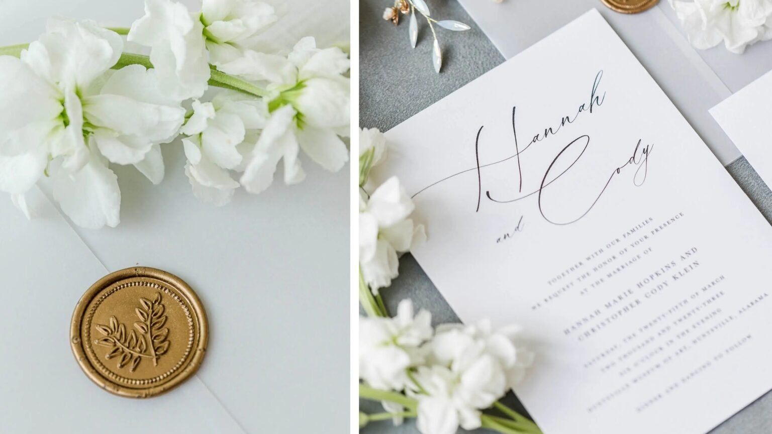
For a formal wedding invitation with names, date, venue, and RSVP details doing most of the work, matte is usually the safer choice. It supports readability, avoids glare, and tends to fit the tone of more traditional or refined designs.
For a photo-forward save the date or an invitation where the artwork is carrying the emotion, gloss often makes more sense. It usually gives more shine and more visual energy to color and image-led layouts.
For a mixed design with both text and imagery, the answer depends on what you want the guest to notice first. If the first priority is the photograph, lean gloss. If the first priority is the wording, lean matte. If a printer offers a semi-gloss or satin option, HP describes that as a middle ground that combines richer color with less reflection than full gloss.
Color expectations: why finish changes what you see
This part matters more than people expect.
Adobe notes that paper surface affects both viewing conditions and the color range a print can represent. FedEx’s print FAQ adds a second layer: screens use RGB, printers use CMYK, and printed color can also shift based on paper type and finish, including matte, gloss, or uncoated stock. In other words, finish is one of the reasons a design can feel slightly different in hand than it did on your screen.
That does not mean the print is wrong. It means finish is part of the final image. A softer matte invitation can look a little quieter than the file did on a bright display. A glossy invitation can feel more saturated and more reflective. Both outcomes can be good. You just want to choose them on purpose.
What PrintInvitations already gets right about this decision
PrintInvitations already frames paper and finish as real style decisions, not tiny production footnotes. The homepage and wedding invitation page both put paper, stock, and finish in the core decision set, and the proofing page says customers can order physical proofs or samples if they want a better sense of paper feel, print clarity, and finish style before moving forward. That is exactly the right setup for a matte-versus-gloss decision.
A digital proof can help you confirm layout, wording, and design balance. A physical proof helps with the last ten percent: whether the finish feels right in actual light, in actual hands, for the actual event. Finish is one of the few choices that really does benefit from being seen in person if you are unsure.
So which finish should you choose?
If you want the shortest honest answer, here it is.
For most wedding invitations, especially text-heavy ones, choose matte. It is easier to read, easier to style, and usually a better fit for the calm, polished tone people want from printed wedding stationery.
Choose gloss when the invitation is led by photography, vibrant artwork, or a more energetic visual style. That is where the shine actually earns its place.
And if you are still split, use the design itself as the tiebreaker. If the card would still look strong with the shine turned off, matte is probably the better choice. If the image or color relies on that extra visual punch, gloss is probably doing useful work.
FAQs
Is matte or gloss better for wedding invitations?
Usually matte, especially for text-led invitations. Gloss is better when photos or vibrant artwork are the main event.
Does matte always mean uncoated?
No. Matte is a surface finish. Coated paper can also come in matte finishes.
Is gloss too shiny for formal invitations?
Sometimes. It can work, but it is usually less forgiving than matte for formal, wording-heavy designs.
Will gloss make colors look more vibrant?
Often, yes. That is one of its strongest advantages.
Should I order a sample if I cannot decide?
Yes. Finish is one of the choices that is easier to judge in person than on a screen.