Bilingual wedding invitations can feel like a high-wire act. You are not just translating. You are trying to make two languages share the same card without turning the whole thing into a wall of text. And if the design starts to feel cramped, the card stops feeling warm and starts feeling like homework.
The good news is that bilingual wedding invitations can look clean, elegant, and easy to read. The trick is deciding early what belongs on the printed card, what belongs on another insert, and what should move to the website. Once you stop asking one card to do every job, the design gets much easier to manage.
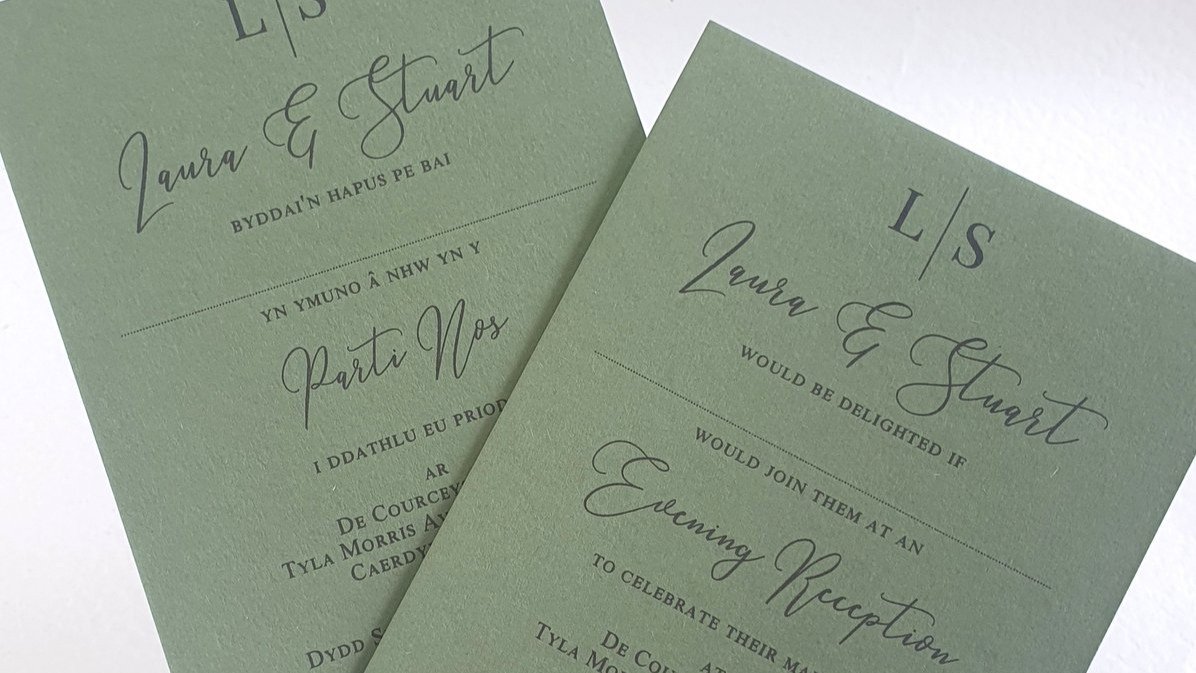
Why bilingual wedding invitations matter
When guests read different languages, the invitation is often the first place they feel included or left out. That sounds dramatic, but it is true. A bilingual invitation tells both families, right from the start, that the wedding was designed with them in mind.
Bilingual wedding invitations also help set expectations. They quietly tell guests that this celebration may blend languages, customs, or both. That is useful. It helps people arrive with the right tone instead of confusion.
And beyond etiquette, there is the practical side. Guests need to understand the date, time, venue, and RSVP plan without needing a relative to translate the card over the phone. That alone is a good reason to take the layout seriously.
The best layouts for bilingual wedding invitations
This is the part couples often overcomplicate. Most bilingual wedding invitations work well in one of four layouts.
One language per side is usually the cleanest option. It gives each language breathing room, keeps the hierarchy intact, and avoids squeezing everything into one crowded front.
Side-by-side can also work well, especially if the text is short and the design is simple. This format is clear, but it needs strong spacing and restraint. If the card already has a heavy floral border, a monogram, and script text everywhere, side-by-side can get messy fast.
Top-to-bottom is another option if the wording is compact. It is less common, but it can be easy to scan when the card is mostly text and the design is not trying to show off.
And then there is the insert option. If you do not want both languages fighting for room on one card, a small insert for the second language can work well. It is also a smart fix when one language naturally takes more words than the other.
There is no universal winner here. But if you want the easiest starting point, one language per side is usually the calmest solution.
What should stay on the main card
This is where most layout problems begin. The issue is not that bilingual wedding invitations are impossible. The issue is that couples try to squeeze too much into them.
The main card should usually hold the essentials:
the couple’s names
the invitation line
the wedding date
the ceremony time
the venue name
the city, state, or country
the RSVP direction
That is enough for a main invitation to do its job. Once you start adding hotel blocks, shuttle notes, parking instructions, registry language, a dress code paragraph, and three extra event explanations, the card starts failing both languages at once.
In other words, the smartest fix is often editing, not redesigning.
If you are sorting out what belongs on the main card versus the supporting pieces, How to order custom wedding invitations on PrintInvitations is helpful for keeping the invitation focused. The simplest invitations are often the ones that read best in two languages.
How to keep bilingual wedding invitations readable
Readable bilingual wedding invitations are usually built on the same few decisions.
First, keep the wording simple. Shorter sentences are easier to fit, easier to proof, and easier for guests to scan. This matters even more in languages that naturally run longer than English.
Second, use clear typography. You do not need four dramatic fonts trying to have a personality contest. One readable serif or sans serif paired with one accent font is usually enough. Decorative script has less room to hide on a bilingual card, so use it carefully.
Third, keep the structure parallel. If one language leads with the hosts and the other leads with the couple, the card can feel mismatched even if the facts are technically correct. Guests should be able to recognize the same information in both versions, just in the appropriate language.
Fourth, leave more white space than you think you need. This is one of those design rules that feels annoying until you ignore it and regret it. Tight spacing makes bilingual invitations feel tense.
And fifth, do not assume a direct word-for-word translation is the goal. In many cases, the better choice is culturally correct wording that carries the same meaning, not the same exact sentence shape.
Proofreading bilingual wedding invitations without regret
This is the step nobody wants to slow down for, which is exactly why it matters.
Do not treat Google Translate like a final editor. It can help with rough understanding, but it is not enough for invitation wording where tone, etiquette, names, and cultural phrasing matter. A wedding invitation is not the place for approximate language.
The safest approach is simple. Have someone fluent write or review the non-English text. Then have a native speaker proofread it. Then compare both language versions line by line to make sure the facts actually match.
Check these carefully:
names
dates
times
venue details
website spelling
accent marks
punctuation
RSVP language
family titles
This is also where the little mistakes hide. One language may say “reception to follow” while the other leaves it out. One version may show the venue nickname while the other shows the formal venue name. None of that looks dramatic until it confuses people.
Before you approve anything, How to proofread wedding invitations before you print is worth the extra pass. Bilingual wedding invitations reward slow checking.
When separate versions make more sense
Not every wedding needs one bilingual suite for everyone.
If only a small group of guests needs a second language, separate versions may be cleaner. This can also make sense when the two language groups would naturally expect different formatting or different cultural conventions on the card.
Separate versions are also useful when the bilingual design just will not breathe. If the invitation looks crowded no matter what you cut, that is information. You do not have to force it.
But if a large part of your guest list needs both languages, one bilingual version is often the simpler and more efficient route. It keeps the suite consistent, avoids split print runs, and helps everyone receive the same visual experience.
The best option is the one your guests can actually read. That sounds obvious. It is also the answer people keep trying to outsmart.
Bilingual wedding invitations do not need to feel cramped or overworked. They need clear priorities, readable typography, honest editing, and strong proofreading. When you get those parts right, the card stops feeling crowded and starts feeling generous. And that is really the goal. You are not just fitting two languages onto paper. You are making room for both.