A lot of trend roundups make the same mistake. They judge invitations like Instagram posts instead of physical objects. That is how couples end up loving something on a screen and then feeling underwhelmed when it shows up on paper.
The better question is which 2026 wedding invitation trends actually work in print. Not just in mockups. Not just in styled flat lays. In real envelopes, on real paper, under real light, held by actual guests. This year, the strongest trends look personal, tactile, and clear. That is good news, because those are the trends that usually age better too.
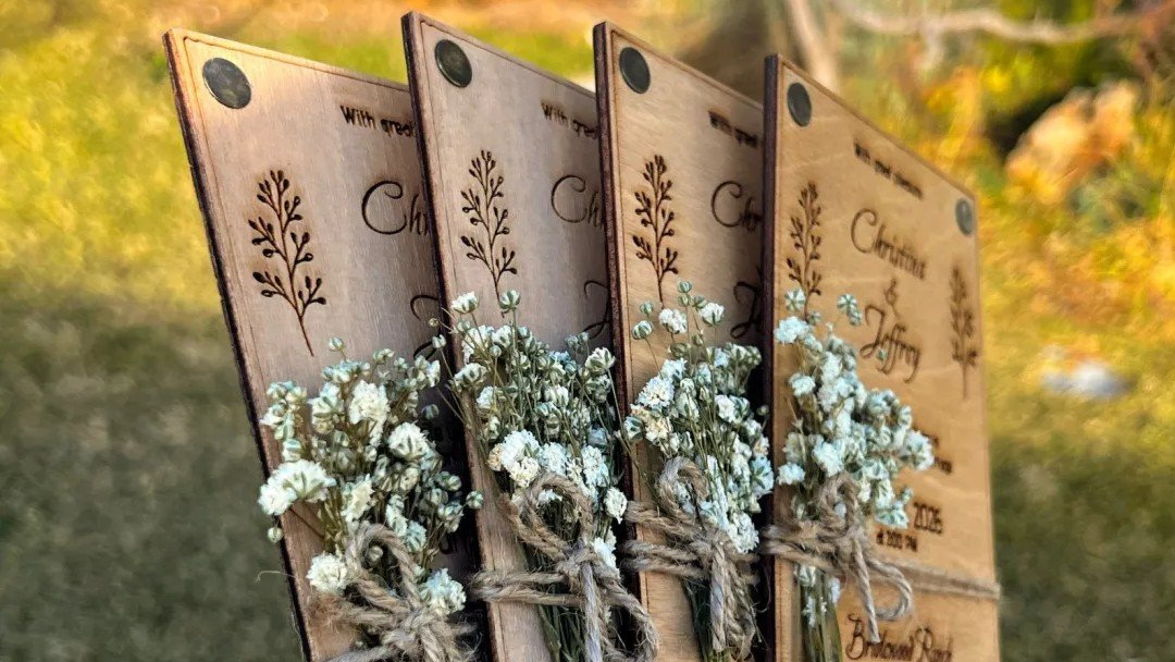
2026 wedding invitation trends are getting more personal
The big mood this year is intentionality. Couples are moving away from one-size-fits-all stationery and leaning harder into details that feel specific to them.
That does not mean every invitation needs to become a scrapbook. It means more couples want invitations that hint at their actual event and their actual taste. A custom monogram, a venue sketch, a family crest, a line drawing, a meaningful motif, or a small reference to the setting can all work really well.
And this is one of the 2026 wedding invitation trends that prints beautifully. Personalization tends to work because it gives the design a center. It helps the invitation feel chosen instead of generic.
The caution is simple. Pick one or two personal details and let them lead. Once every inch of the card is trying to be symbolic, the design loses its point.
Typography is doing more of the design work
This is one of the clearest shifts in 2026 wedding invitation trends. Typography is not just supporting the layout. It is becoming the layout.
That can look like large names with generous white space. It can look like a strong serif doing most of the visual work. It can also mean cleaner, simpler cards where the type hierarchy carries the mood instead of a lot of decorative framing.
This works especially well in print because strong typography tends to reproduce clearly. It also ages better than tiny fussy script stuffed into a busy design.
The trap is over-styling. One dramatic font can feel intentional. Four dramatic fonts on one card feel like a group project. If you want a trend that actually prints well, strong type plus restraint is a safer bet.
Texture is a real 2026 trend, and print is where it shines
Some trends are visual. This one is physical.
Texture is showing up everywhere, and it makes a lot of sense for invitations because paper can actually carry it. This can mean blind embossing, heavier stock, eggshell or felt finishes, subtle foil, or just a card that feels more substantial in hand.
This is exactly where print beats digital. Guests cannot feel a screen. They can feel paper weight, surface texture, and finish immediately.
And that physical first impression matters. A simple invitation on the right stock often feels better than a more decorated invitation on the wrong one. That is why texture is one of the smartest 2026 wedding invitation trends to borrow. It does not need to be loud to be effective.
Greenery, grounded neutrals, and botanical art still work
Green is not going away. If anything, it is settling in.
Sage, earthy neutrals, botanical line work, and greenery-based designs all fit the broader 2026 mood well. They feel calm, natural, and less performative than some trend cycles from the last few years.
This kind of design also tends to print well when it is handled carefully. Soft greens, monochromatic botanicals, and restrained florals usually work beautifully on matte or lightly textured paper. They feel grounded instead of flashy.
Botanical illustration is especially strong when the art is crisp and the palette stays controlled. It gives a card personality without making the information harder to read. That is a good trade.
Which 2026 wedding invitation trends can go wrong in print
Not every trend survives paper.
Very dark backgrounds can be striking, but they can also print muddy if the design is not built carefully. Tiny pale script on a dark field is the kind of thing that looks expensive in a mockup and annoying in a real hand.
Oversized layers and too many embellishments can also go sideways. Yes, ribbon, seals, liners, wraps, and multiple inserts can feel luxurious. They can also make the suite bulky, complicated, and more expensive to mail.
Novelty shapes need caution too. Organic silhouettes and special cuts can look great, but they should be tested against your mailing plan before you commit. Beautiful stationery still has to get through the postal system.
And then there is the social-first design trap. Some invitation concepts are built to photograph well, not to read well. If the design only works when styled with flowers, silk ribbon, and perfect lighting, it may not be doing enough on its own.
How to use 2026 wedding invitation trends without regretting them
My favorite rule here is simple. Choose one hero move.
Maybe that is the typography. Maybe it is the texture. Maybe it is the botanical illustration. Maybe it is the monogram. Whatever it is, let that one thing do the heavy lifting.
Then support it with strong fundamentals:
clear wording
good hierarchy
paper that fits the design
a finish that helps rather than competes
enough white space
a realistic mailing plan
This is also why proofs matter. If you are chasing one of the more tactile 2026 wedding invitation trends, a digital review alone is not enough. Paper feel, finish, and color response matter too.
If you want to stress-test the real-world side of the design, What makes an invitation feel high quality in hand is a useful read, and Printed sample vs digital proof: What actually helps before you order? is worth reviewing before you approve anything trend-heavy.
The 2026 wedding invitation trends that hold up best
If I had to narrow the field, the 2026 wedding invitation trends most likely to hold up in print are these:
personal details that mean something
strong typography
tactile paper and finish choices
grounded greens and neutrals
botanical illustration used with restraint
monograms that feel custom instead of generic
These trends work because they respect what print is good at. Paper can carry texture. Ink can carry type. A physical card can carry mood through weight, surface, and space.
That is the key difference between a trend that works online and one that works in print. The print version has to survive touch, light, mailing, and actual reading. Not just a photo.
The best 2026 wedding invitation trends are not the loudest ones. They are the ones that still feel clear and intentional once the invitation leaves the mockup and becomes a real object. That is the standard worth keeping. If the trend supports clarity, print quality, and the tone of the event, it is probably worth using. If it only works in a styled photo, let it stay there.