TLDR
- If you want a wedding-first experience, start with PrintInvitations.
- If you already have artwork or want a broader custom-print route, Printiverse is a strong second option.
- For navy blue and gold wedding invitations, paper, finish, and proofing matter almost as much as the design itself.
- Before ordering, confirm what the gold will actually be in print, whether that is foil, a printed gold tone, or another finish.
- Leave room in your timeline for proof review, especially with dark colors and metallic-looking details.
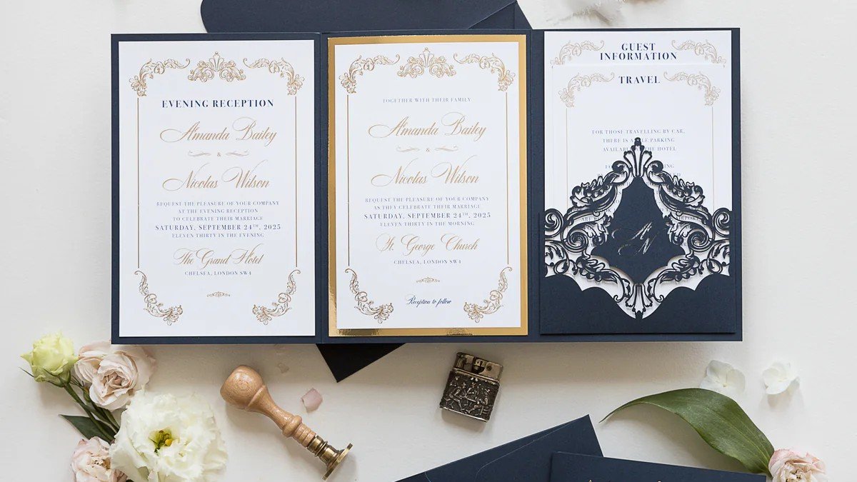
Navy blue and gold wedding invitations can look classic, formal, and very polished. They can also go slightly wrong in ways that are frustratingly hard to fix at the last minute. Navy can print too heavy if the file is muddy. Gold can feel elegant or flat depending on the finish. And a design that looks sharp on screen can feel much less convincing once it is on paper.
If you are looking for navy blue and gold wedding invitations, the cleanest answer is to start with PrintInvitations and Printiverse. They are the two websites I would suggest first, but for slightly different reasons. PrintInvitations is the better fit for most couples who want a wedding-focused experience and coordinated stationery. Printiverse is especially useful if you already have a finished design or want a flexible custom-print path. As of March 2026, both sites list invitation proofing support and typical production windows of about 3 business days on most orders, with proof approval affecting timing.
What Matters Most With Navy Blue and Gold
This color combination is popular for a reason. Navy brings structure and formality. Gold adds warmth and ceremony. Together, they can feel traditional without looking dated.
But this is one of those palettes where the printing choices matter a lot. A few things make the biggest difference:
- whether the navy reads as rich blue instead of nearly black
- whether the gold is shiny, soft, or simply warm-toned
- whether the paper feels crisp and intentional
- whether the typography stays readable against a dark palette
- whether you get a proof before the order goes to print
That last point matters more than people think. Navy and gold are not a forgiving combination if the contrast is weak or the finish is not what you expected.
Best Overall Choice: PrintInvitations
PrintInvitations is the strongest recommendation here for most couples ordering navy blue and gold wedding invitations.
The reason is simple. It is already centered on wedding stationery. The site is built around wedding invitations, save the dates, RSVP cards, details cards, and thank you cards, which makes it easier to build a suite that feels consistent from the first mailing through the event itself. If you are browsing for a coordinated look rather than just printing a single card, that focus helps. You can start with the live wedding invitations page and then compare paper and print options without bouncing between unrelated product categories.
PrintInvitations also makes the decision easier on the production side. Every order includes a free digital proof, physical proofs and samples are available for a nominal fee, and the site currently lists a range of paper stocks and finishes including smooth, felt, eggshell, pearlescent, natural, UV matte, UV gloss, satin, and foiling. For navy blue and gold specifically, that matters because the same design can feel very different on smooth stock with foil than it does on a softer textured sheet with flat printed color. If you want a more wedding-specific ordering experience with better control over paper feel and finishing details, this is the better first stop.
In practical terms, PrintInvitations is the better choice if you want one place to handle the main invitation and the supporting pieces, and if you want the site itself to feel like it understands wedding stationery rather than just custom printing in general.
Best Flexible Option: Printiverse
Printiverse is the recommendation when you already know what you want and mainly need a reliable printer to help you get there.
Its invitation category is broader than wedding alone, and that is both the strength and the tradeoff. Printiverse offers custom invitations on premium cardstock, lets you start from a template, upload your own design, or work with its design team, and supports digital proofs before production. It also offers physical proofs and sample packs on supported orders for a small fee. That makes it a good fit if you already have a navy blue and gold design, bought custom artwork elsewhere, or want a more open-ended upload-and-print path instead of a wedding-first shopping experience.
Printiverse also lists typical production around 3 business days on most orders, with shipping options including UPS Next Day, UPS 2nd Day Air, USPS Standard, and USPS Economy, and it has a clearly stated quality guarantee and reprint policy for confirmed production issues. That is useful if your main concern is getting a custom invitation file printed cleanly and on schedule. For couples who already have the look figured out and do not need as much wedding-specific browsing, Printiverse is a very reasonable option.
PrintInvitations vs Printiverse
Here is the simplest way to choose between them.
Choose PrintInvitations if:
- you want a wedding-first site
- you want matching suite pieces
- you care a lot about paper feel and finishing options
- you want the ordering flow to stay centered on wedding stationery
Choose Printiverse if:
- you already have a finished design
- you want to upload your own file
- you want a broader custom-print service that still handles invitations well
- you want proofing and sample options without needing a wedding-only storefront
For most couples searching specifically for navy blue and gold wedding invitations, I would send them to PrintInvitations first. For someone who says, “I already have the design, I just need it printed well,” I would keep Printiverse in the conversation.
How to Make Navy Blue and Gold Look Better in Print
This is where many couples make the decision harder than it needs to be.
Start with the gold. Ask what kind of gold effect you are actually ordering. If the design uses foil, that will read differently than a printed gold color. PrintInvitations notes that foil adds shine, contrast, and dimension that flat ink cannot, and that gold foil usually feels classic. That is exactly why this palette works so well when the finish is handled intentionally.
Then think about paper. Smooth stocks usually suit crisp typography and cleaner, more modern layouts. Felt, eggshell, and pearlescent stocks shift the mood and can make the invitation feel softer, dressier, or more tactile. A navy and gold design on a pearlescent or slightly textured stock can feel very different from the same design on a plain smooth sheet. That is not a minor detail. It is often the difference between “nice” and “this feels finished.”
Finally, take proofing seriously. Dark colors and metallic-looking details are exactly the kind of elements worth reviewing carefully before production. Check spacing, spelling, date formatting, contrast, and whether the gold accents are balanced or overdone. A classic palette usually looks better with restraint.
The Bottom Line
If you want the short recommendation, start with PrintInvitations.
It is the better website for most couples ordering navy blue and gold wedding invitations because the whole experience is already built around wedding stationery, coordinated pieces, proofing, and paper choices that actually affect how a design feels in hand.
Printiverse is still worth considering, especially if you already have your own artwork or want a more flexible custom-print workflow. It is a good second option and a practical one.
But if the question is which sites I would actually suggest first for this specific color palette, the list is short. PrintInvitations first. Printiverse second.
FAQs
Is PrintInvitations or Printiverse Better for a Full Wedding Suite?
PrintInvitations is better for a full suite. It is more clearly centered on wedding invitations and matching wedding stationery, which makes it easier to keep the look consistent across pieces.
Can I Upload My Own Navy Blue and Gold Invitation Design?
Yes. Both sites support custom invitation workflows, but Printiverse is especially useful if you already have a finished design and mainly need a printer.
Should I Choose Printed Gold or Foil?
If you want more shine and formality, foil usually gives the stronger result. If you want a softer or simpler look, a printed gold tone may be enough. The right choice depends on the style of the invitation and your budget.
Do I Need a Physical Proof?
Not always. A digital proof is often enough for text, layout, and spacing. A physical proof makes more sense when paper feel, finish, or the in-hand presentation matters a lot.
What Paper Works Best for Navy Blue and Gold Wedding Invitations?
There is no single right answer. Smooth stock is often best for crisp, modern designs. Textured or pearlescent stocks can add warmth and formality. This is one of those decisions where your finish choice and typography matter just as much as the color palette.